
University community
echoes concern over
new logos
Critics say UH missed a chance to
get faculty and student designs
The University of Hawaii should scrap the six proposed logos, some students and faculty members said yesterday.
They agreed with nearly half of their counterparts and members of the public who voted for "none of the above" in a UH online logo poll.
"I personally don't like any of them. They're all hideous," said David Anderson, graduate student in secondary education. "If the public has that kind of opposition against the logos, they (the committee) need to think about it."
University officials unveiled the six logos July 30 and allowed the public to send comments and vote online until Thursday; 49 percent of the 660 comments said they do not want any of the logos.
"If it ain't broke, then don't fix it," said Keanu Sai, a doctorate candidate in political science.
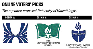
Design No. 3, a U that is embraced by an H, had the most amount of support with 18 percent.
In second place, design No. 6, a Hawaiian canoe sail created by a U and an H with the word Malamalama written across had 10 percent, followed by design No. 4, an open book with a torch in the middle, with 9 percent.
According to Star-Bulletin's "The Big Q," voters agreed that design No. 3 was the best with 36 percent of the votes, followed by design No. 4 at 23 percent. Design No. 1, similar to the No. 6 design with a map in the background, was third with 13 percent. A "none of the above" option was not available.
Of the e-mails that the university received, community members left both praise and criticism for the designs as well as suggestions.
Many of the responses said the university should create a contest among students and faculty members to design the logo rather than go to outside design firms.
"They're missing the opportunity to make the logo truly belong to us," said Jim Hollyer, project manager for the College of Tropical Agriculture and Human Resources.
Anderson said the university should have gone straight to students and faculty after President Evan Dobelle in April 2003 scrapped the "wave" and the "spectrum" logos designed by a Maryland company. "We're stuck in the same place again," he said.
The logo is intended to unite UH's 10 campuses, which have more than 150 logos.
The public's feedback will be presented at a committee meeting on Wednesday. The committee will make recommendations for a logo or could decide to reject all of them. The Board of Regents will act on the recommendations in a meeting later this year.
Phil Kinnicutt, director of marketing and brand management, said he was pleased with the response they received. "It shows that people really care about the University of Hawaii," he said. "People were really thoughtful in putting their responses together."
Graphic House and Clarence Lee Design, both of Honolulu, and Sae Design, of Maui, received $5,000 each for two designs. The successful firm would receive another $5,000 for the final design.
www.hawaii.edu