
Ballot may confuse, A University of Hawaii design expert said there are some fundamental problems with the design of the 2002 primary election ballot that could make it difficult for some voters to read.
design expert says
The UH graphic design
professor sees ways the form
could lead some voters astrayBy Pat Omandam
pomandam@starbulletin.comStuart Henley redesigned the ballot earlier this year at the state's request.
Chief Elections Officer Dwayne Yoshina strongly supported Henley's design and pushed hard for the changes, but only a few of them were used.
Rex Quidilla, election administrative assistant, explained yesterday there were technical reasons why the elections office could not use more of Henley's design.

Quidilla said Election Systems & Software, which is under contract to run the next three state elections, had questions about how accurately its voting machines could read the ballot's design."We believed it was intuitive, it was easy on the eyes and provided better and cleaner delineation between party ballots. ES&S also agreed, but the difficulty at that point was designing a ballot that would have reliable reads," he said.
The final product is the best ES&S could do, Quidilla said.
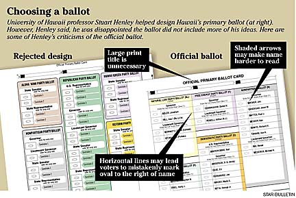
Henley, assistant professor of graphic design at UH, said voters may mistakenly fill in the oval after a candidate's name instead of the oval before it, which is the correct mark.
Also, he said, the first letters of the candidates' names are hard to read because of the shaded background arrows that reduce contrast and diminish readability.
"It may not affect you or me, but if you're 85 and your sight's not so good, I would say that's not an ideal situation to be confronted with," Henley said.
Henley added that the text size of the voters instruction is too small. Finally, he would not have placed the words "official primary ballot card" so prominently at the top of the card since voters know that is what they are given when they vote.
"All of these things separately are very small, and they seem insignificant. But when you add them up together, that's when I think you start to see that one piece of paper is easier to understand than another piece of paper," Henley said.
Following a national trend to involve graphic designers to make ballots more intuitive and voter-friendly, as well as to address concerns raised by some Hawaii voters, the state Office of Elections asked Henley to redesign the ballot.
Henley started from a blank slate and came up with a new design that eliminated much of the confusion involved in a multicolored primary election ballot.
His design eliminated many of the perplexing horizontal and vertical lines on the ballot and instead focused on defining the borders of each political party so people would stick to voting for candidates within just one party.
Also, he removed any excess or redundant information from the sheet and increased the text size of the instructions. The human eye, he said, is naturally drawn to the largest text, and, in this case, that should be the instructions on how to vote.
Henley submitted his design to the Elections Office in late February.
But Henley did not hear back from the office and did not know what the final primary election ballot looked like until he was given a sample ballot this week by the Star-Bulletin.
Henley said he was disappointed the office did not implement more of his design elements, but he understands the situation.
Quidilla said: "It's like anything else. When you design a car, it looks fantastic on the drawing board, but once you get the engineers involved and the manufacturing people, the product changes significantly at that point."
Quidilla stressed that redesign of the ballot is an ongoing process.
Meanwhile, voters did not appear to be having any problems with the ballot's design at the absentee walk-in voting site at Honolulu Hale.
Absentee voter Page Dwight said yesterday, "I don't think it was as clear as it could have been."
She did not have any problem with it, but she can see how some people might. She added that poll workers were very helpful.
Voters can view a sample ballot for their precinct at the Office of Elections Web site by typing their street name, Social Security number or state House district number.
The Web site address is www.state.hi.us/elections.
Star-Bulletin reporter Craig Gima contributed to this report.