Advertisement - Click to support our sponsors.

Friday, July 28, 2000
Rainbow comments
upset gay activists
Athletic Director Hugh Yoshida
More reader reaction Staff and wire reports
tells KGMB that concern about
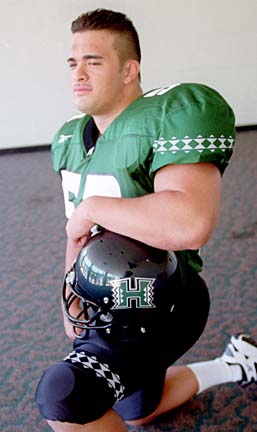
image was a factor in the logo changeWhen University of Hawaii officials announced this week they were nixing the football team's 77-year-old rainbow logo, they emphasized the Native Hawaiian theme of the new one, an "H" edged in traditional kapa design.
With the change came a new nickname for the Rainbow Warriors, who are now known simply as the Warriors.
But after receiving praise for highlighting native culture in the new design, the university is being criticized by gay rights advocates. That's after athletic director Hugh Yoshida acknowledged the decision to change the logo stemmed, in part, from concerns about how the rainbow has become a symbol of gay pride and acceptance.
"That logo really put a stigma on our program at times in regards to it's part of the gay community, their flags and so forth," Yoshida told KGMB-TV in remarks aired yesterday. "Some of the student athletes had some feelings in regards to that."
Yoshida made the statement after a ceremony on campus Wednesday at which the new logo was unveiled. During that ceremony, attended by 500 invited guests, assistant women's volleyball coach Charlie Wade also alluded to the rainbow's gay theme.
"I can't be certain, but I think that the rainbow had something to do with a flight attendant giving me his phone number one time," Wade told the audience.
Ken Miller, co-chairman of the Gay and Lesbian Community Center in Honolulu, called the university's concern about the old logo bigoted and ignorant.
"It sends a very bad message -- not only to the students but the athletes who happen to be gay and struggling with that issue," Miller said.
Gay rights advocate Kuumeaaloha Gomes said she was disappointed in school officials.
"I think they missed the opportunity to use it as an educational tool to educate people who were questioning it at different universities," Gomes said.
In his remarks to KGMB, Yoshida said the decision to part with the rainbow was not anti-gay.
"The intention was never (to) pinpoint any groups out there. We are just trying to get a new image out there," he said.
Yoshida could not immediately be reached for comment yesterday.
In a statement, university spokesman Jim Manke said: "The university is sorry if anyone was offended.
"That was not the intent of the remark. It was an example to illustrate potential confusion over the rainbow."
The old symbol and nickname had stemmed from the rainbows that appear nearly every day over verdant Manoa Valley, where the university's main campus is located, and throughout much of the state.
Love it or Hate it
... the debate
continuesTravis Ruetenik, Walnut Creek, Calif. "I love it. Sorry, but the old logo really needed to be retired. It looked like something designed by a kid with a box of Crayolas. And not the 64-pack, mind you, I'm talking the 8-pack with the big fat crayons. Love it
Brian Misty, Washington, D.C. I think that the new logo is impressive and comes just at the right time. Time to start beating up on those arrogant mainland teams again.
Ray L.Rivera, Kentucky. Aloha from the Bluegrass State! I think the new University of Hawaii logo looks great -- very powerful. The blockish, stylized 'H' gives the appearance of rock-solid athletic stability -- the essence of which your football program (under coach Jones) seems to have already achieved. At the risk of sounding offensive, the old rainbow logo looked cute, but certainly no more than that -- cute. The old logo isn't as intimidating looking to me as your newly inspired Polynesian warrior design. Now if you UH folks could only convince officials at my alma mater (the University of Tulsa) to follow suit and come up with something more appropriate than a Golden Hurricane and a bland, dated, cursive-script 'Tulsa.'
Lori A. Kozey, Honolulu. Love it! It's much nicer than that 1970s-looking rainbow thing. The kapa patterns add a nice cultural touch, too. I might even consider buying a shirt or something now.
Jerome M. Hodges, North Carolina. I love it. I was raised in Waipahu and I now live in North Carolina. I try to follow the football team through the newspaper or the Internet. If there is an extra UH sticker laying around I would love to have it and put it on my car.
Steve Yagyagan, San Diego. I like the new logo. So, will (Hugh) Yoshida and the UH administration drop the "Rainbow'' name for all UH sports teams, including the Rainbow Warrior mascot and simply refer to the teams as either UH Warriors and UH Na Wahine Warriors? It would be more consistent with their marketing efforts. It's disappointing that when enthusiasm for UH sports is so high, the athletic department decided to detract from that with the replacement of the Rainbow logo with something that is sure to be unpopular with many Rainbow (oops, can I still say that?) fans.
Reneil Magday, Santa Clara, Calif. It's about time they got rid of the old logo. Most teams are changing their logos and for some, it's been for the better. Look at the (Denver) Broncos and the (New England) Patriots a few years back. How about UH last year? They went to the black helmets and new but temporary logo and what happened? WAC champs.
The logo will definitely take some time to get used to but I like it. It's different but catchy.
If it'll do good for the university, monetary wise and exposure-wise, I say, "Go Warriors.''
Paul Krogh, Waikiki. The new logo has a sense of Hawaiian pride. The old logo reminded me of a tourist promotion anyway.
Rex Maximilian, Manoa. The new logo is a more confident and strong one. I would like to see the introduction of livelier colors instead of the dull green, silver and black. However, the Rainbow was outdated and not a proper nickname for a sports department in a major university wanting to compete amongst the Fighting Irish, Longhorns, Bruins, Trojans, Huskies etc.
Jim Roser, Honolulu. That logo's terrible. It looks like it came out of Mr. Rogers' neighborhood. Hate it
That 'H' is so ugly it will probably get kicked out of the alphabet.
Rich Figel, Kailua. Back in December 1998, on the day of Fred von Appen's last game as head coach of the UH football team, my wife and I saw a rainbow in the distance as we trudged towards Aloha Stadium. The 'Bows had not won a game all year, and we hoped it was a sign that something good might come out of their worst season ever. But when we entered the stadium, we heard cheers and groans that had nothing to do with football. Gathered around the TV monitors above the snack stand counters, were groups of people watching the UH Wahine volleyball team playing BYU for the WAC championship. When I saw all those different-colored local faces, young and old alike, I realized what that rainbow truly represented. The Wahine won, and a loud ovation went up throughout the stadium, baffling the University of Michigan football fans who couldn't understand what all the fuss was about. After all, we were about to get our butts kicked on the football field... and yet Hawaii fans had found something to celebrate, even if we had to look across an ocean to find it on a volleyball court somewhere over the rainbow. The football team got thumped, all right. But when we left the stadium, I kept thinking about how wonderful and unique it is to be a Rainbow fan -- good times or bad. Where else will you find so many races, so many different cultures, that come together in one place, for one purpose? If the rainbow isn't a symbol for the people of Hawaii to rally around, what is? Don't let some Mainland design firm or marketing consultant take that away from us.
Kerry Lewis, Aiea. I think the entire logo, the whole program, is an absolute joke. They hired this firm that's going to make this great design, and they do it around the letter 'H.' The worst logos in the country are around letters.
Keith Terashima, Pearl City. I think the UH logo has lost our identity in these islands. There is no identity to the new logo. It looks like any other mainland school logo. In fact it looks worse than the others. No color. No originality. No identity, nothing. How anyone ever came up with something so common and unoriginal for the UH logo is beyond me. Before this, even though we had a bad team, at least we had something original.
Wally Bachman, Kaimuki. The ugly new UH logo -- I bet that public input was either absent or scarce before its unveiling. It looks as if a shark has taken a bite out of the big 'H' -- with the white area implying that something is missing besides the 'U' for University and the colorful rainbow. Perhaps it was designed by the same fellow that drew the plans for the new softball stadium, where you could not see home plate.
Patricia Dubois, Makiki. I do not like the new logo. I would say there was nothing wrong with the old one and there are many rainbows in Hawaii so why not stay the Rainbows? If it ain't broke, don't fix it.
Sharon Pomroy, Anahola, Kauai. I think it (the new logo) lacks the beauty, courage and symbolism of the Rainbow. Like almost every other sport team name, the name Warriors abound from Little League to the professional level. Nowhere else is there a name that shines like a Rainbow. Now that some fool has dropped the Rainbow from the University of Hawaii, who wants to bet that it appears under some other team venue somewhere and rather quickly too. Long live the Rainbow Warriors.
Beach DeCastro, Wahiawa. Whoever is responsible for this new logo should have polled the student body and those who support the UH athletic programs. There was no reason to replace the old logo. To me, the old logo was the right call because it truly gave identity to the University of Hawaii and was very traditional and recognized throughout the islands and the mainland. A poor decision by a minority to replace something valued by the majority.
Anthony Nagatani, Manoa. I really don't like the new UH Rainbow print. I think literally spelled out, you know, the full University of Hawaii, it looks fine. But I think just a logo with just the jagged kapa "H", I find it rather weak.
Dot Mason, Makiki. I don't like the new logo. I think it's very trendy. I think it looks kind of native American, but it does not look Hawaiian to me. I think the rainbow is irreplaceable. I really want the rainbow back.
Fabian Kaulukukui, Nanakuli. I'm not in favor of the new logo. We're the only state that has the rainbow, and it really shows us better than the new logo.
Radji Tolentino, Kaimuki. I don't like it and the change to just "Warriors.'' Bring back the Rainbow which has been part of our school's history for such a long time. Imagine the UCLA Bruins or the Texas Longhorns suddenly changing their mascots. The rainbow has long been associated with UH and should remain so in the future."
Rick Winslow, Kaneohe. I personally hate the new logo. It's got no style. It's got nothing to distinguish it from anybody else.
Dorothy Ogan, Pearl City. I heartily disapprove the new UH logo -- it is hideous, and has nothing to do with the tradition of the university. Our two children graduated from UH, we have been season ticket holders for 25 years,and this new logo is simply ridiculous. The traditional rainbow has been around for years, we have the Rainbow tournaments, etc. and now this travesty. I feel the students and the citizens of Hawaii should have had some say in the choice of a new logo, not a merchandising outfit from the Mainland.
Clifton Tay, Kalaheo. I grew up in Hawaii, born and raised on Kauai. I have long been a supporter of UH athletics, especially the men's and women's volleyball teams. I grew to like the Rainbow as it characterized Hawaii, granted it didn't invoke fear into the other teams. I also thought that when they later added the Rainbow Warriors I thought that UH had found a great mascot that embodied the Hawaiian culture and spirit. Currently, I attend a major university on the mainland that is a part of the Big Ten Conference. I hear many things about UH football, especially in their remarkable turnaround season all the way on the East Coast. Every time, however, a comment is made about having their mascot be a rainbow. Usually, laughter or chuckling ensues. However, as I watched as the University of Hawaii unveiled their new logo, my first reaction was one of laughter. Why did they waste all that money for someone to design a stylized 'H'? No matter how you cut it, the logo leaves me baffled. What are you gonna call the new sports teams? The Hawaii....(insert name here.) Exactly. If they thought the Rainbow didn't invoke fear in their opponents, what is an 'H' going to do? If you asked me, they should have saved that money and put it into academic sources to cool the financial woes of the university.
Harry E. Beasor Jr., Aiea. I think UH just lost it's identity. Rainbows are a part of Hawaii. You see one just about every day. Are we going to call the Wahine Warriors, too? What about Rainbow Stadium. Is it going to be renamed Warrior Stadium? I just think it was a bad call all around.