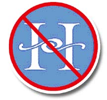
UH logo
quest brings out
readers’ creativity
We asked if you could come up with a better University of Hawaii logo and Star-Bulletin readers responded to the challenge.
We received about 65 logo ideas before Friday, among them submissions from fifth-graders in Diane Gibbons' class at Waimanalo Elementary and Intermediate School.
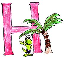
This design by Waimanalo Elementary fifth-grader Hauoli Wilkinson and mom was among the 65 logos suggested by readers as alternatives to the official University of Hawaii designs.
"I always like to give my kids challenges about something that's going on," she said.
"We talked about the impact and power of a logo," she said. The class discussed what logos they liked, the purpose of a logo, and how the logo will represent the University of Hawaii.
Last week, UH President Evan Dobelle scrapped two proposed designs after the university heard from many people who complained that the designs were either no good or cost too much money or not made in Hawaii -- or all of the above.
Gibbons said she showed the schoolchildren the two logo finalists and the reaction was immediate and unanimous: "Ugh, it doesn't even look like Hawaii," the children told her.
So the Waimanalo fifth-graders and dozens of other readers submitted ideas that do look more like Hawaii. Rainbows, flowers, maile and the islands themselves are themes that appear in many of the submissions.
Jack Randall, of Honolulu, said the maile vine growing upward in his design "symbolizes the constant reach for knowledge and understanding which is the foundation of the university system."
Proud UH graduate Kawika Grant of Pearl City says his design is a combination of an ipu gourd and a calabash bowl. "At the top of the U ... are two hands touching an overarching rainbow. The hands are in the rough and simple style of Jean Charlot -- whose art, like the rainbow, not only graces our Manoa campus, but reflects the essence of our diverse peoples."
Kate Wester, a university spokeswoman, said UH is still trying to determine what happens next with the logos since Dobelle scrapped the two finalists.
"It's not completely back to the drawing board. It's back to the drawing board in terms of design," she said.
One thing that the logo controversy has shown is that people are passionate about the university, Wester said.
"If this has done anything, it has united a community," she said.