Advertisement - Click to support our sponsors.

Thursday, July 27, 2000
The new University of Hawaii
Readers react By Dave Reardon
logo design is exciting to
some, but upsetting to others
Star-BulletinThe Warriors have arrived, but the Warrior mascot is gone. It's the end of the Rainbows, but the Rainbows live on.
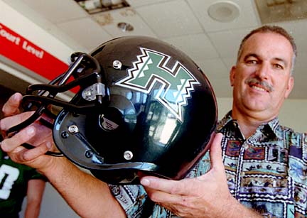
Confused? Eventually, the one unifying constant of the University of Hawaii athletic department's new image is supposed to bring it all together. It's a dark-green block "H" logo with Hawaiian kapa -- triangles symbolizing body, mind and spirit.
UH officially unveiled the not-so-secret secret design yesterday before about 500 invited guests at the Stan Sheriff Center.
The distinctive logo is the flagship of the athletic department's unified direction mandated by former university president Kenneth Mortimer. But, a Rainbow selection of familiar team nicknames remain.
While the football team is now officially the Warriors, the other sports' coaches are free to choose from Rainbow Warriors, Warriors, Rainbows, Rainbow Wahine and Wahine.
"We're still going to be the Rainbow Wahine," assistant women's volleyball coach Charlie Wade said. "We're not eliminating that from our name."
Still, the rainbow image is gone, and after 77 years, it is no longer the football team's name.
At first glance, the new image is intriguing to many, disconcerting to others and infuriating to at least one.
"Reaction has been very, very positive," UH athletic director Hugh Yoshida said. "We've had some reaction from individuals who prefer Rainbows (to Warriors), but so far overall it's been very positive."Kauai born-and-raised Kurt Osaki is the lead designer of the logo and overall new look. He has also designed for NFL teams.
"I grew up here and feel like I still live here. This is the greatest state, with the greatest people," said Osaki, a UH graduate who now lives in Berkeley, Calif. "I hope the logo represents Hawaii well. I hope it brings pride to Hawaii.
"Every project means a lot to me, but this one was extra special."
Osaki's company reportedly received a $35,000 commission for the project, but UH expects to make that back many times through aggressive marketing of merchandise not only in Hawaii, but on the Mainland and in Asia and Australia.
UH got a quick start on that yesterday, as at least one shirt with the new logo on it will be worn on the East Coast soon. Linda Shen, a tourist from Boston, bought some T-shirts from the RainBowTique at the Sheriff Center.
"Serendipity," Shen said. "We were going to get some UH stuff anyway. I guess our timing was good."
RainBowTique sales associate Kory Uramoto said sales were brisk, especially of black T-shirts featuring the new logo.
"It reminded me of game-time," she said. "But it seemed like people had mixed feelings. People still like the rainbow.
"I have mixed feelings myself. I like the colors of the rainbow, and the rainbow is the symbol of Manoa."
Wahine volleyball player Lily Kahumoku said she will miss the rainbow, but she likes the new designs.
"I think the logo says Hawaii. I like the tribal printing, the kapa and shark's-tooth. I think local people can relate to it and it makes UH more marketable and it says only Hawaii. There's no question what the 'H' stands for," she said.
"I do miss the rainbow, but I think this is a good change."
Pi'ilani Smith was looking for change, but did not like what she saw yesterday. The former UH student body president put on a one-person protest.
During the arena presentation of the new logo and uniforms, Smith repeatedly shouted, "Stolen Hawaiian lands" through the otherwise quiet crowd.
Smith helped lead the movement that resulted in the shelving of the UH football warrior mascot last fall. (Football coach June Jones quipped yesterday that "all I know is he was 0-12.")
Smith railed yesterday against the use of Hawaiian icons in the new logo design, as well as the Warrior nickname.
"My issue is about institutionalized racism. Not so much the marketing, but the misappropriation of the Hawaiian image," Smith said. "They're using what will sell, but it doesn't belong to them. This university stands on stolen land.
"The issue is no longer about the mascot, the issue is no longer about this hideous logo. The issue is about misappropriating identity (and) racist slurs."
Smith also said Rainbows is a more appropriate nickname than Warriors.
Yoshida said the designs were thoroughly researched for cultural sensitivity, and experts at the university's Center for Hawaiian Studies were consulted.
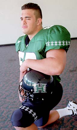
Craig Stutzmann, a receiver on the football team, will be wearing the logo this fall. He said he is looking forward to it.
"I think it's great. I like it a lot better, especially the colors," he said. "I knew it would raise some issues, but overall I think it's better for the program. I can't wait to get in one of those helmets and start banging heads."
The new uniform got approval from a former player, too.
"I think it's rather attractive and it shouldn't seem offensive to anyone," former UH receiver Kyle Mosley said.
Stutzmann and Mosley also agreed with the change from Rainbows to Warriors.
"Being called the Rainbows, especially for men's teams, left them open to ridicule," Mosley said. "Warriors has a much stronger connotation."
Wade said the word "rainbow" is a loaded one, especially on the Mainland.
"This logo says Hawaii, and Hawaii only. Once you get away from Hawaii, (Rainbow) can mean a lot of different things."
Wade pointed out some of them while addressing the gathering: auto racer Jeff Gordon's pit crew known as the Rainbow Warriors, Jesse Jackson's Rainbow Coalition, and the gay movement.
Two former UH athletes contacted by the Star-Bulletin said they were greatly against the change in the football nickname from Rainbows to Warriors. Both declined to be identified in this article.
"Change is awkward for some people," Wade said. "But the decisions that have been made over the past 18 months (at the UH athletic department) have been fabulous. Why should this be different?"
As the logo gets television exposure, its distinctiveness will make a big impact, Yoshida said.
"The floor of the Stan Sheriff Center now sends as unique a message as there is in the nation," he said.
"It's a strong message about our identity."
Former volleyball star Yuval Katz modeled some of the new attire yesterday.
"I think it's good. It represents Hawaii," Katz said. "Change is good. The rainbow is obvious. We'll always be Rainbows even if it's not on the logo."
At least in spirit.
Here are comments the Star-Bulletin received in response to the question: Do you like the new University of Hawaii logo? Out with the old...
Rex Horita, Palolo: "I like it. You know, it's very nice. It's trendy. It has the Hawaiian kapa print. That's a good touch to it. The only thing I object to is black. I don't think black should be in the color of the scheme of the rainbows of green and white."
Eric Olmos, Makiki: "I don't have much to say about the new logo. It's just ugly, and I like the old one better."
Alice Kamahele, Kaimuki: "I like the old logo because it says UH and the Rainbows. It just goes together. The other 'H' doesn't do anything. It's just 'H' nothing."
Elsie Hollingsworth, Pearl City: "I want to register my disgust with the new Hawaii logo. I don't know how they got to the stage where they're actually painting it on the floor. It's static. We are Hawaii Rainbows. I don't see anything that was wrong with the logo that we had. They need to come up with something that actually reflects. It's very static looking. It has very little to do -- that sharp points and angles -- that doesn't even to me reflect kapa. There's a lot of kapa designs that would have been better suited. I don't know who came up with this, but I think it's a lousy design. We are the Hawaii Rainbows. Let's get a rainbow in there some place."
Priscilla Brede, Kailua: "I do not like this new University of Hawaii logo. It does no justice for the University of Hawaii Rainbows, and I like the old symbol and changing it might not bring good luck for the team. And right now we have a good team, all good coaches, so please don't change that logo."
Jack Martins, Lanikai: "I like the new logo very much. The old one was an embarrassment. I thought it was really Mickey Mouse."
David Sumida, Aiea: "I think the new logo is great. It's very bold, it's very graphic, and it's very Hawaiian, and I think it will make a great tattoo design."
Diane Wong, San Francisco: "Like it. Makes creative use of traditional design elements and is a more powerful visual image."
Blayne Sato, Hilo: "I like it a lot. In this day and age of marketing, the new logo along with the color schemes will definitely put money into the budget of UH. Hope that this means that all sports will have similar uniforms (no orange in baseball, yellow with the wahine). The name thing bothers me though; they should all be called the same, i.e. Rainbow Warriors for the men and Rainbow Wahine for the Wahine."
Becky Fitzgerald, Aiea: "The University of Hawaii athletic department will no longer get any of my money from the purchase of apparel or other souvenir items with the new logo. The new logo does not appeal to me at all. Just looking at it annoys me and I find something about the design very irritating. Bring back the rainbow!"
Charlie Colburn, Ala Moana: "Why? What was wrong with the Rainbows? I have to believe many, if not most, are not going to approve. Bring back the 'Bows."
Rich Figel, Kailua: "If the rainbow isn't a symbol for the people of Hawaii to rally around, what is?"
Travis Lum, Alewa Heights: "I love the new logo. It sure beats the old."
Judith Lewis, Nuuanu: "You're right: Love it or hate it. I hate it. Destroys what Hawaii means to many, on many levels -- warmth, colorful, paradise, unique, close to nature, multiethnic (rainbow coalition). ... I know the new image, especially with black and silver, was to give the impression of brute force, strong and scary -- not Hawaii at all, maybe football to some, but the U of H is not only football to many of us. The new logo is a sellout, a PR nightmare and false, false, false!"
George MacRae, Virginia Beach, Va.: "I like it! As a former resident... I am a real fan of all University of Hawaii teams. But it is time for change and black and silver is sharp looking when used in good uniform designs. Carry on!"
Scott Lum, Seattle: "My gosh, how ugly can you get! As a UH grad living on the mainland, I'm always concerned at how the people on the mainland view things in Hawaii. This logo has got to be the worst. How many people outside the islands will know that the design is an old Hawaiian kapa pattern? After seeing the poor attempt to incorporate it into the university's logo, how many people will care? Our logo is an important part of our brand and usually one of the first impressions made on people. Rainbows, the ocean, native foliage and flowers -- these things represent Hawaii."
Brian Kajiyama, Kailua: "Bring back the old one. The UH with the rainbow scheme made people notice us. Rainbows have a special significance here in Hawaii and our environment lends itself to showcase this aspect of nature, rainbows. The rainbows made us unique!"
Randolph Hack, Kaimuki: "I don't like the new logo. Hawaii is the Rainbows. We are the rainbow state."
Nobu Nakamoto, Aiea: "I hope I can still buy stuff with the Rainbow logo. And why, since they've dumped the rainbow, are they selling the new stuff at the RainBowTique? Shouldn't they be sold at the H-tique?"
Pam Toyooka, Makiki: "I don't mind the way 'Hawaii' is shown on the floor of the 'Stanley.' It has a classy, 'Hawaiian-ish' feel to it. But I don't think I would like just the 'H' by itself. ... And I really don't like the jagged 'H' that is shown by itself. I much prefer the old logo with the 'UH' next to the rainbow."
Aaron Lau, Nuuanu: "If you take out the Rainbow piece of the logo, what will our nickname be? The H's? The block letter is supposed to have a kapa print trim. I do see a slight hint of what they tried to do, but the Hawaii theme is not obvious. If I were from the mainland and I saw this 'H', I wouldn't connect Hawaii with it at all."
Richard Duggen, Kaneohe: "I think the new logo for U of H is really good for many reasons. It is bold, distinctive, proud and edgy. It is two colors, so printers won't have as many problems reproducing it. I didn't really like the old logo anyway. It looked like U of H was falling off the end of the rainbow."
Jim Risser, Makiki: "They paid money for this?! The rainbow best represents the multi-ethnicity of Hawaii. The rainbow is prevalent in Manoa Valley. Does June Jones hate the rainbow?
Kimberly Vierra, Waipahu: "As a UH graduate, I am somewhat disappointed to find out the old logo changed, but when I really look at and compare the two, I like the new one better -- it's definitely bolder and more collegiate looking, not whimsical like the multi-colored rainbow logo. So change isn't necessarily bad. I could get used to this one."
Louise Langley, Ewa Beach: "I like the old logo better because it's alive. The new logo looks real dead, boring."
John Iwashita, Waialae-Kahala: "I think the new logo is ugly. The rainbow is synonymous with UH, especially the Manoa area."